Aujourd’hui, je voudrais vous parler d’un package R incroyablement utile pour l’analyse de données : Tidyverse. Si vous êtes un utilisateur régulier d’R, vous avez probablement déjà entendu parler de lui, mais sinon il est temps de rectifier cela tant ce dernier est important! Qu’est-ce que le package Tidyverse le Package Tidyverse est un ensemble […]
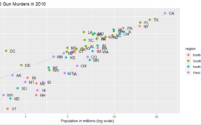
Dans cet article, nous allons explorer comment créer un scatterplot en utilisant ggplot2, une librairie de visualisation de données en R. Après avoir expliquer l’intérêt du scatterplot ou nuage de points, nous allons vous guider pas à pas dans le processus de création d’un scatterplot basique, jusqu’à une personnalisation avancé de celui-ci. In fine, que […]
Tout le monde connait les histogramme. S’il y a bien un graphique (en plus du Diagramme circulaire ou camembert qui ne devrait pas exister à mon avis…) qui est utilisé partout et tout le temps, c’est l’histogramme, enfin au moins lorsqu’il s’agit de représenter la distribution d’une variable quantitative. Comment créer un histogramme sur RStudion? […]
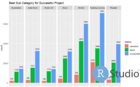
Si vous ne le connaissez pas encore ggplot2 est l’un des packages les plus populaires de R. On peut même dire que c’est le package le package le plus emblématique pour RStudio, également connu et envié par les utilisateurs de python. En plus d’avoir beaucoup de possibilité pour pouvoir créer des graphiques à la fois […]