Today I would like to tell you about an incredibly useful R package for data analysis: Tidyverse. If you’re a regular R user, you’ve probably already heard of it, but if not, it’s time to rectify that because it’s so important! What is the Tidyverse package The Tidyverse package is a set of R packages […]

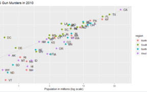
In this article, we will explore how to create a scatterplot using ggplot2, a data visualization library in R. After explaining your interest in the scatterplot, we will guide you step by step in the process of creating a basic scatterplot, up to advanced customization of it. In fine, whether you are a beginner or […]

Histograms are a useful visualization for representing the distribution of a quantitative variable. With ggplot2, it is easy to create attractive and customized histograms using the geom_histogram() function. Histograms are what we call one-variable charts, because you only see one variable, which makes it a very simple chart to use. How to create a histogram […]

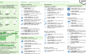
If you don’t know it yet, ggplot2 is one of the most popular packages for R. It is arguably the most iconic package for RStudio, also known and envied by python users. Besides having many possibilities to create attractive and powerful graphics, it is relatively easy to use but also very powerful. In this article, […]