
Main functions of the ggplot2 package for RStudio
Share
If you don’t know it yet, ggplot2 is one of the most popular packages for R. It is arguably the most iconic package for RStudio, also known and envied by python users. Besides having many possibilities to create attractive and powerful graphics, it is relatively easy to use but also very powerful. In this article, we will show you the main features of ggplot2, from its basic functions, and creating basic charts to advanced customization, you will learn how to use ggplot2 to visualize your data in a clear and concise way.
Translated with www.DeepL.com/Translator (free version)
The 5 main functions of ggplot2 to create a graph
The ggplot2 package is a powerful and popular tool in the world of data visualization in R. It efficiently creates high-quality graphs. Here are some of the main functions of the ggplot2 package:
ggplot(): This function creates a new graph from raw data or data previously organized in a “data frame” object in R.aes(): This function defines the variables to use for the x-axis and y-axis of the graph, as well as any colors or sizes to use in representing the data.geom_*(): There are many “geom” functions in ggplot2, each of which is used to plot a particular type of graph (e.g.geom_point()to plot points,geom_histogram()to plot a histogram).scale_*_*(): These functions allow for customization of the scale of the axes of the graph, as well as other aspects of the presentation (e.g.scale_x_log10()to use a logarithmic scale with base 10 for the x-axis).facet_*(): These functions allow for the creation of “facets”, which are divisions of the graph into multiple subplots based on an additional variable. For example,facet_wrap()allows for the creation of facets by wrapping the subplots on top of each other.
One can put these functions into practice by using the dslabs package like this:
(as a reminder the dslabs package is a set of data and tools for teaching statistics and data science. It contains many interesting datasets that can be used to create graphs using ggplot2).
The mains ggplot2 Graphics
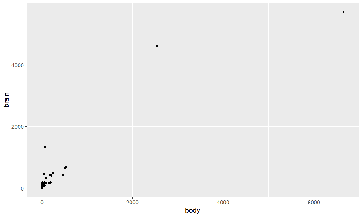
geom_point()
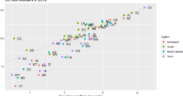
Let’s start by making a scatterplot showing the relationship between two numerical variables, using the geom_point() function. We will use the data(mammals) from the library(mass).
library(MASS)
library(ggplot2)

# Load the data
data(mammals)

# Create the graph
ggplot(mammals, aes(x = body, y = brain)) +
  geom_point()
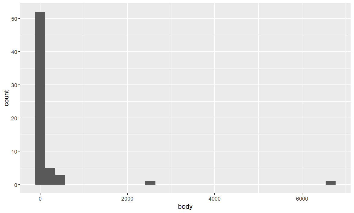
geom_histogram()
Now we will make a histogram showing the distribution of a numerical variable. To do this, we will use the geom_histogram() function. Once again We will use the data(mammals) from the library(mass).
ggplot(mammals, aes(x = body)) +
  geom_histogram()
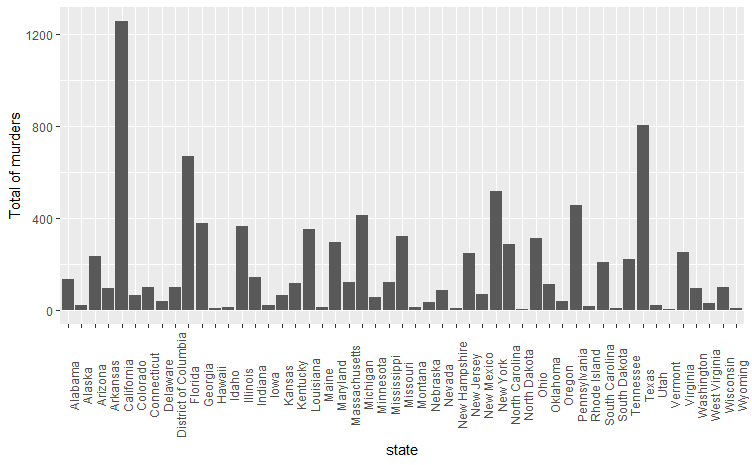
geom_bar()
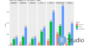
We are now going to make a bar chart or barplot showing the effect of a categorical variable on a numerical variable. We will do this using the geom_bar() function but this time with the data(murders) of the library(dslabs). We are going to use the “gridExtra” library to enter the readable x scale..
library(dslabs)
library(gridExtra)
data(murders)
library(ggplot2)
ggplot(murders, aes(x=state, y=total)) +
  geom_bar(stat="identity") +
  xlab("state") +
  ylab("Total of murders") +
theme(axis.text.x = element_text(angle = 90))


