
How to use geom_histogram() of ggplot2 on Rstudio
Share
Histograms are a useful visualization for representing the distribution of a quantitative variable. With ggplot2, it is easy to create attractive and customized histograms using the geom_histogram() function. Histograms are what we call one-variable charts, because you only see one variable, which makes it a very simple chart to use.
How to create a histogram with ggplot2?
First, make sure you have ggplot2 installed and loaded in your working environment. To do this, run the following lines of code:
Les histogrammes sont une visualisation utile pour représenter la distribution d’une variable quantitative. Avec ggplot2, il est facile de créer des histogrammes attrayants et personnalisés en utilisant la fonction geom_histogram().
install.packages("ggplot2")
 library(ggplot2)
- Next, create a data set for your histogram. You can use an existing variable from your working environment or create a new one using the rnorm() or runif() function. For example:
data_set <- rnorm(1000)
- Once you have a dataset, use the ggplot() function to create an empty ggplot object. In the function parameters, specify the dataset to use and the variable to display in the histogram. For example:
ggplot(data = data_set, aes(x = data_set))
- Add a histogram layer to the empty ggplot object using the geom_histogram() function. For example:
ggplot(data = data_set, aes(x = data_set)) + geom_histogram()
There are several configuration settings you can use to customize the appearance of your histogram. Here are some examples:
- color : allows you to change the color of the histogram bar border. For example : geom_histogram(color = “red”).
fill:allows to fill the histogram bars with a specific color. For example : geom_histogram(fill = "blue").bins : allows to specify the number of bins (or groups) in the histogram. For example : geom_histogram(bins = 20).alpha :allows to specify the transparency of the histogram bars. For example : geom_histogram(alpha = 0.5).
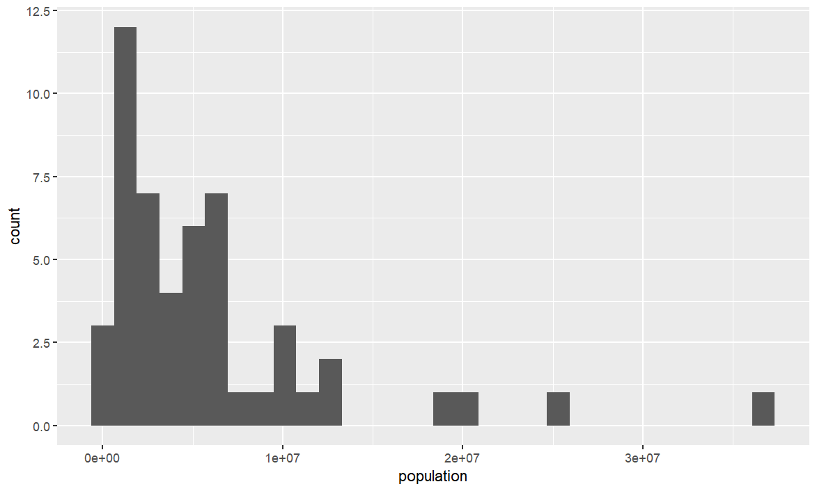
Here is an example of code that uses the dslabs package and the muder library to create a histogram using ggplot2 :
Create a histogram with geom_histogram() on ggplot
#Loading data and libraries
library(dslabs)
library(ggplot2)
data(murders)

#Creating the basic graphic
ggplot(data = murders, aes(x = population)) +
geom_histogram()
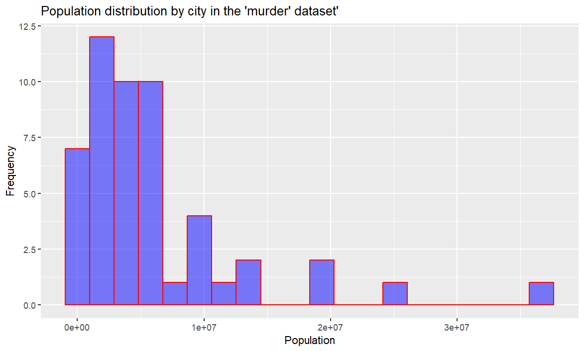
Customizing the histogram using the configuration parameters
This time we will add different parameters or arguments to customize the graph further
Several arguments are passed to the geom_histogram() function to customize the appearance of the histogram:
color : allows you to change the color of the border of the histogram bars. Here, the color is set to "red".- fill: fills the histogram bars with a specific color. Here, the color is set to “blue”.
alpha : allows to specify the transparency of the histogram bars. Here, the transparency is set to 0.5 (half opaque).bins : allows you to specify the number of bins (or groups) in the histogram. Here, the number of bins is set to 20.
The ggtitle() function is used to add a title to the histogram, xlab() is used to add a label to the x-axis and ylab() is used to add a label to the y-axis.
ggplot(data = murders, aes(x = population)) +
geom_histogram(color = "red", fill = "blue", alpha = 0.5, bins = 20) +
ggtitle("Population distribution by city in the 'murder' dataset'") +
xlab("Population") + ylab("Frequency")
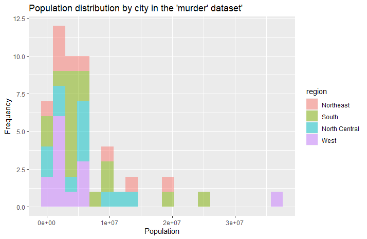
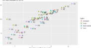
The “fill =” function that we used to give a color to our bars, can also be used to give information about the data. For example here, we can use the value “region” which will allow us to see quickly which are the regions of the United States concerned. It is however necessary to move the “fill” parameter in the basic ggplot() function:
ggplot(data = murders, aes(x = population, fill = region)) +
+     geom_histogram(alpha = 0.5, bins = 20) +
+     ggtitle("Population distribution by city in the 'murder' dataset'") +
+     xlab("Population") + ylab("Frequency")


