
Create a scatterplot on R with ggplot2
Share
In this article, we will explore how to create a scatterplot using ggplot2, a data visualization library in R. After explaining your interest in the scatterplot, we will guide you step by step in the process of creating a basic scatterplot, up to advanced customization of it. In fine, whether you are a beginner or an advanced R user, this article will allow you to create professional-quality graphs for your data analysis.
What is a scatterplot?
Let’s start by defining a scatterplot.
A scatterplot is a type of graph used to represent bivariate data, i.e. data with two variables measured for each observation. The scatterplot is considered to represent each observation by a point on a Cartesian plane, where the horizontal axis represents one variable and the vertical axis represents the other variable. This means that the points are arranged on the graph according to the values of the two variables for each observation.
The primary interest of the scatterplot is that it allows you to visualize the relationship between the two measured variables, showing whether there is a correlation between them (for example, if the points are arranged along a line or curve) or whether they are independent of each other (for example, if the points are randomly scattered on the graph).
How to create a Scatterplot with ggplot2
If you have not yet installed and loaded the ggplot2 package, let’s start there (in this case, I invite you to discover our dedicated article on ggplot2 : “Main functions of the ggplot2 package for RStudio“. We will also load our dslabs library to use the data, and tidyverse to simplify the writing with pipes (%>%).
install.packages("ggplot2")
library(ggplot2)
library(dslabs)
library(tidyverse)
data(murders)
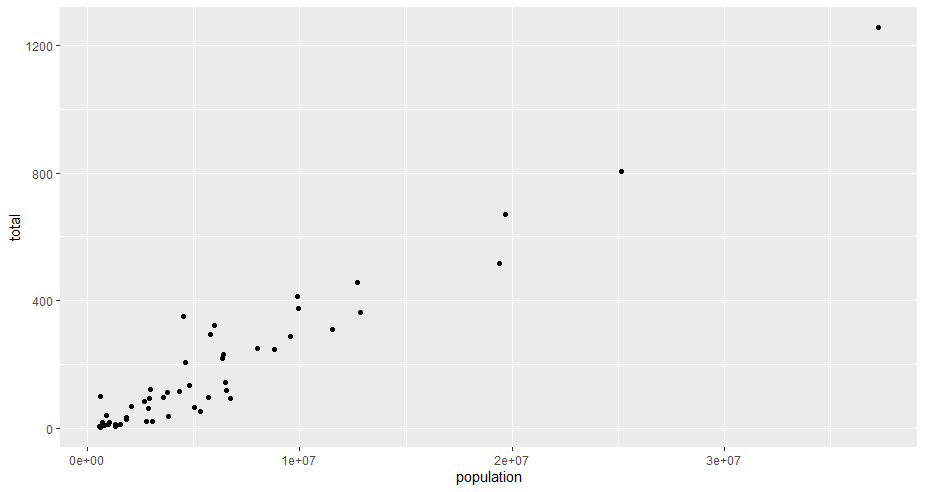
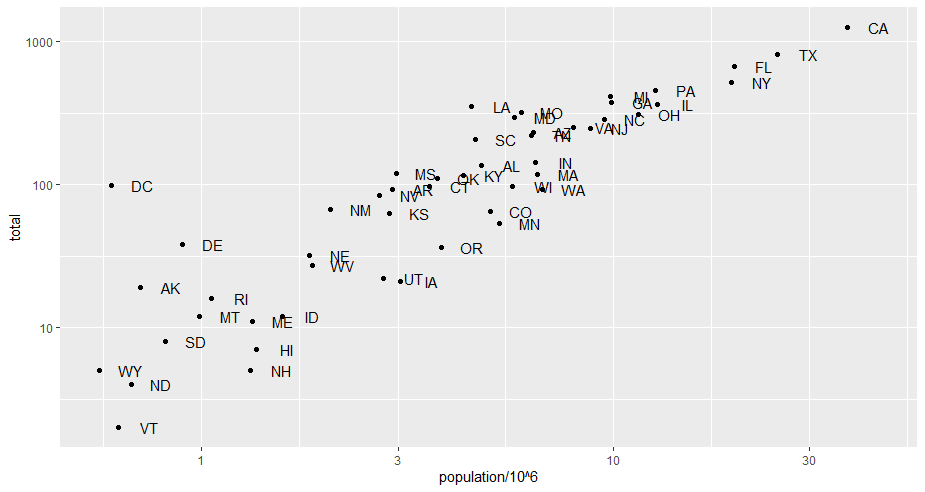
To create a scatteplot with ggplot2, we will use the geom_point() function with two variables. As we are using again the dslabs package and the data murders, we will use the total number (of murders) reported to the population of the states for our first plot.
murders %>% ggplot()
+     geom_point(aes(x = population, y = total))
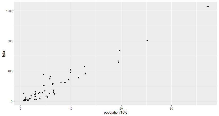
To make the x-axis more readable, we will transform the population into “million”.
murders %>% ggplot() +
+     geom_point(aes(x = population/10^6, y = total))
Customize a scatterplot with ggplot2
We will now progressively customize our graph. For the sake of simplicity, we will create a “p” object as basic as possible, and add parameters to it progressively (for example “+ geom_point()”).
##creation of the p object with the basic graph.
p <- murders %>% ggplot(aes(population/10^6, total))
Add labels to points
To add “lables” or “labels” to the points, we will use the geom_text() function with the “label=” parameter like this
p + geom_text(label = murders$abb)
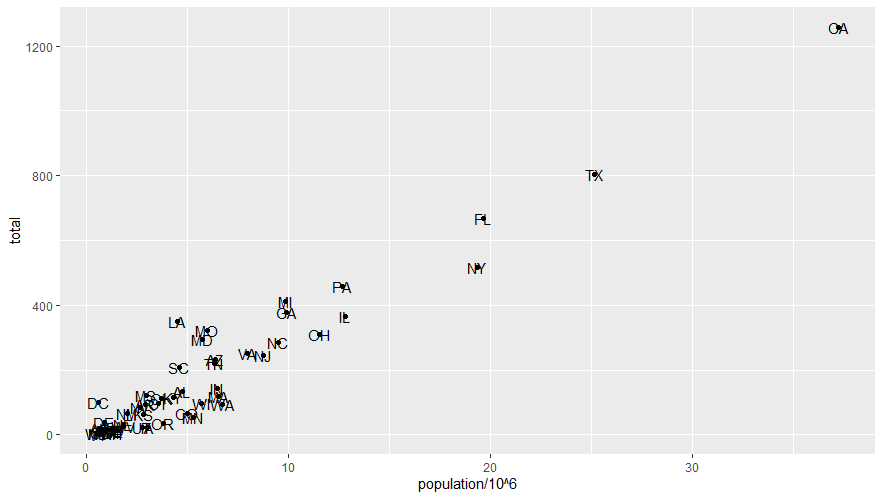
Shift texts with nudge_x or nudge_y
by executing this code, we can see that the abbreviations are on top of the texts and therefore make it unreadable. So we will shift the texts thanks to “nudge_”.
## Redefine p to include labels
p <- murders %>% ggplot(aes(population/10^6, total, label = abb))

## Add a horizontal offset (nudge) to labels
p + geom_point() +
+     geom_text(nudge_x = 1.5)
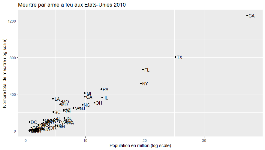
Add titles to the axes and the graph
We are now going to add titles to the axes, as well as to the graph with the functions “xlab() / ylab()” and ggtitle(). We will also
## Add titles to axes and graph
p + geom_point() +
    geom_text(nudge_x = 0.75) +
    xlab("Population en million (log scale)") +
    ylab("Nombre total de meurtre (log scale)") +
    ggtitle("Meurtre par arme à feu aux Etats-Unies 2010")
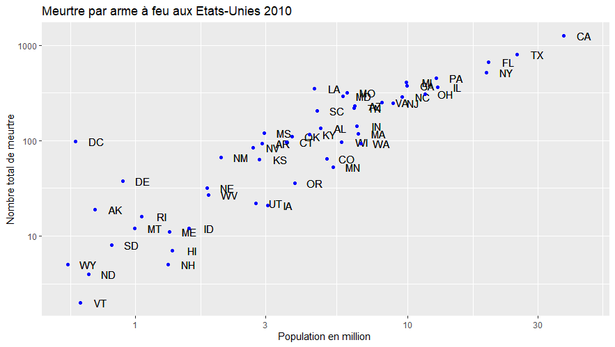
Change the scale of the graph
To change the scale of the graph we can use the functions scale_x/y_log10() and thus have a logarithmic scale.
p + geom_point() +
    geom_text(nudge_x = 0.75) +
    scale_x_log10() +
    scale_y_log10() +
    xlab("Population en million (log scale)") +
    ylab("Nombre total de meurtre (log scale)") +
    ggtitle("Meurtre par arme à feu aux Etats-Unies 2010")
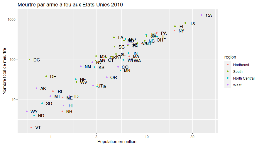
Add colors to points
You will now add colors to your points. For this we have two choices. Either assign a color to all the points, or assign a color to points according to a category variable.
- Use the “color =” attribute when designing a color (red, blue, light blue, green, dark green,…)
- Use “col” in the aes of the geom_point() variable and use the “region” category
#Redefine P to get the titles
p <- murders %>% ggplot(aes(population/10^6, total, label = abb))
p <- p + geom_point() +
geom_text(nudge_x = 0.075) +
scale_x_log10() +
scale_y_log10() +
xlab("Population en million ") +
ylab("Nombre total de meurtre") +
ggtitle("Meurtre par arme à feu aux Etats-Unies 2010")
# Add blue color to all points
p + geom_point(size = 3, color = "blue")
# Add colors to the points according to their region
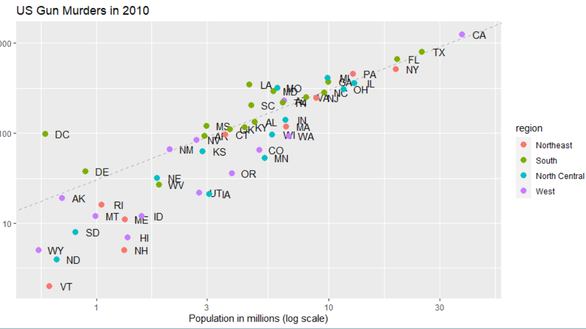
p + geom_point(aes(col = region))
Add a line representing the average
Finally, we will add to our graph a line representing the average. This will be done with the geom_line() function. However, it must be defined beforehand.
# definition de la moyenne
m <- murders %>%
    summarize(rate = sum(total) / sum(population) * 10^6) %>%
    pull(rate)

# basic line with average murder rate for the country
p + geom_point(aes(col = region), size = 3) +
   geom_abline(intercept = log10(m))
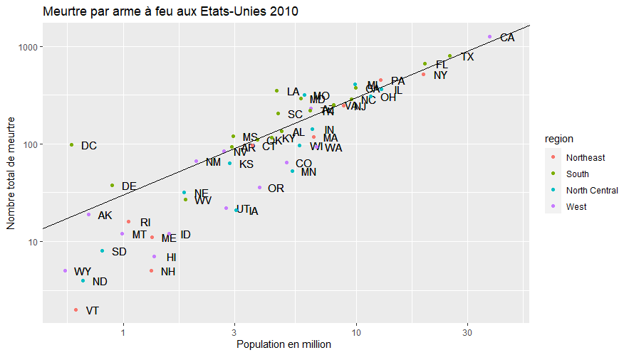
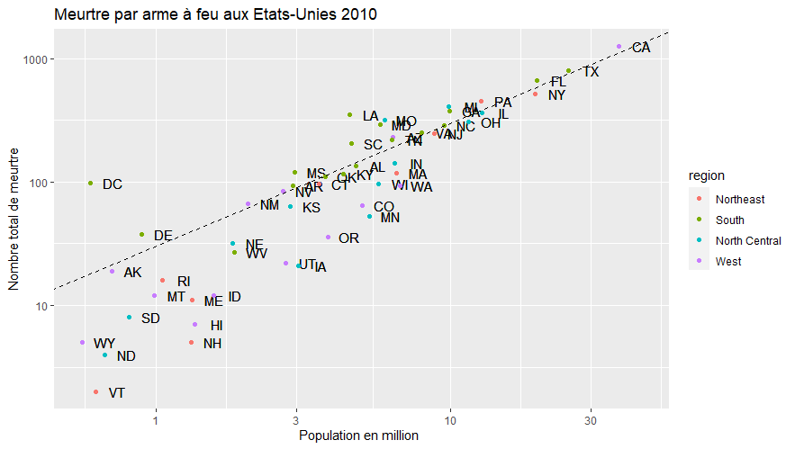
This line gives us an important information but however it hides a part of the data, we will realize a last modification to this one to have a dotted line, much more readable.# basic line with average murder rate for the country
p + geom_point(aes(col = region)) +
  geom_abline(intercept = log10(m), lty = 2)
