
Today, I’m introducing you to the Shiny package for R and RStudio. If you are an R user and are looking for a way to create interactive web applications, Shiny might be the perfect solution for you. Shiny is an open-source package for R that makes it easy to create interactive web user interfaces without […]
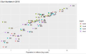
In this article, we will explore how to create a scatterplot using ggplot2, a data visualization library in R. After explaining your interest in the scatterplot, we will guide you step by step in the process of creating a basic scatterplot, up to advanced customization of it. In fine, whether you are a beginner or […]
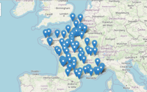
Do you need to create interactive maps for your spatial data analysis? Look no further! With RStudio and the leaflet package, you can easily create interactive maps to visualize your spatial data simply and beautifully. In this article, we will show you how to create an interactive map using the leaflet package for RStudio. And […]
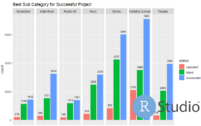
Histograms are a useful visualization for representing the distribution of a quantitative variable. With ggplot2, it is easy to create attractive and customized histograms using the geom_histogram() function. Histograms are what we call one-variable charts, because you only see one variable, which makes it a very simple chart to use. How to create a histogram […]
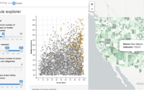
Hello everyone! Today, I will be talking about the 5 best data visualization packages for R. If you work with data, you know how important it is to be able to visualize it effectively in order to understand trends and relationships between variables. There are many available packages for R that allow for creating impressive […]
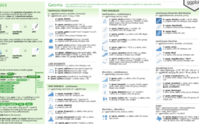
If you don’t know it yet, ggplot2 is one of the most popular packages for R. It is arguably the most iconic package for RStudio, also known and envied by python users. Besides having many possibilities to create attractive and powerful graphics, it is relatively easy to use but also very powerful. In this article, […]